Onglets
Calendrier
Slider
Accordion
Datepicker
Dropdown
Datagrid
Graphiques
Navigation
Tooltip
Autocomplete
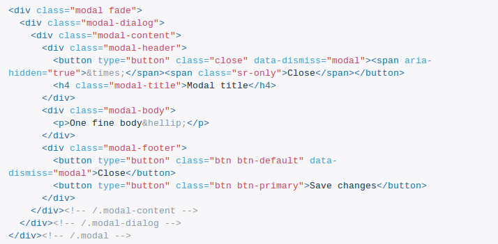
Modal
Overlay
Drag n'drop
Tree
Panels
Notification
<h1>
<p>
<section>
<div>
<form>
<input>
<span>
<img>
<svg>
<select>
<textarea>
<a>
<li>
<pre>
<canvas>
<footer>
<aside>
<article>
YUI().use('sortable', function(Y) {
    var sortable = new Y.Sortable({
        container: '#demo',
        nodes: 'li',
        opacity: '.1'
    });
});
require(
    ["dijit/layout/TabContainer", "dijit/layout/ContentPane"],
    function(TabContainer, ContentPane){
        var tc = new TabContainer({
            style: "height: 100%; width: 100%;"
        }, "tc1-prog");
        var cp1 = new ContentPane({
             title: "Food",
             content: "We offer amazing food"
        });
        tc.addChild(cp1);
        var cp2 = new ContentPane({
             title: "Drinks",
             content: "We are known for our drinks."
        });
        tc.addChild(cp2);
        tc.startup();
    }
);
var tabs = $("#tabs").tabs({
    tabTemplate: "...",

    add: function(event, ui) {
        ...
    }
});

tabs.tabs("add", "#project", "foo")
    .tabs("select", tabs.tabs("length") - 1);
var TabbedArea = React.createClass({
    handleClick: function(idx, e) {
        e.preventDefault();
        this.props.switchTab(idx);
    },
    render: function() {
        return this.transferPropsTo(
            <div>
                <ul className="nav nav-pills nav-justified">
                    {this.renderTabs()}
                </ul>
                <div className="tab-content">
                    {this.renderPanes()}
                </div>
            </div>
        );
    },
    ...
});
MyApp.DatepickerComponent = Ember.TextField.extend({
    didInsertElement: function() {
        this.$().datepicker();
    }
});
Challenges
- Packaging (comportement, styles, assets)
- Gestion des dépendances
- Theming
- Déclaration & utilisation
<tabs-panel>
<x-calendar>
<input is="slider">
<b-accordion>
<drop-down>
<data-grid>
<chart-donut>
<nav-bar>
<tether-tooltip>
<input is="autocomplete">
<x-modal>
<b-overlay>
<core-drag>
<b-tree>
<paper-panel>
<notification-flash>
<element name="tick-tock-clock">
    <style>
        :host { display: block; }
    </style>
    <template>
        <span id="hh"></span>
        <span id="sep">:</span>
        <span id="mm"></span>
    </template>
    <script>
        var tpl = document.currentScript
                               .parentNode.querySelector('template');
        ({
            readyCallback: function () {
                this._root = this.createShadowRoot();
                this._root.appendChild(tpl.content.cloneNode(true));
            }
        });
    </script>
</element>
Custom Elements
Définir de nouveaux éléments HTML
<hello-world></hello-world>
var HelloWorldPrototype = Object.create(HTMLElement.prototype);
HelloWorldPrototype.createdCallback = function() {
  this.textContent = "Hello world!";
};

var HelloWorld = document.registerElement('hello-world', {
  prototype: HelloWorldPrototype
});
Custom Elements
Lifecycle callbacks
- createdCallback
- attachedCallback
- detachedCallback
- attributeChangedCallback
Custom Elements
Etendre des éléments existants
<button is="super-button"></button>
document.registerElement('super-button', {
    prototype: SuperButtonPrototype,
    extends: 'button'
});
HTML Templates
<template id="comment-tpl">
    <div>
        <img src="">
        <div class="comment-text"></div>
    </div>
</template>
var tpl = document.querySelector("#comment-tpl");
document.body.appendChild(tpl.content.cloneNode(true));
Shadow DOM
Composition & encapsulation DOM/CSS
<template id="modal-tpl">
    <div class="modal">
        <content></content>
        <button>Close</button>
    </div>
</template>
var root = this.createShadowRoot(),
    tpl = document.querySelector("#modal-tpl");

root.appendChild(tpl.content.cloneNode(true));
Shadow DOM
Composition
                                    <div class="modal">    <content></content>    <button>Close</button>
</div>
                                Shadow DOM
|
<div class="modal">
    <h3>My title</h3>
    <p>Lorem ipsum</p>
    <button>Close</button>
</div>
                                Composed DOM
|
                                    <x-modal>    <h3>My title</h3>
    <p>Lorem ipsum</p></x-modal>
    Light DOM
|
Shadow DOM
Insertion points
                                    <div class="modal">
  <div class="modal-title">    <content select="h3">...</content>  </div>    <content></content>    <button>Close</button>
</div>
                                Shadow DOM
|
<div class="modal">
    <div class="modal-title">
        My title
    </div>
    <p>Lorem ipsum</p>
    <button>Close</button>
</div>
                                Composed DOM
|
                                    <x-modal>    <h3>My title</h3>    <p>Lorem ipsum</p></x-modal>
    Light DOM
|
Shadow DOM
Multiple subtrees
                                    <template id="super-button-tpl">
    <div class="super-button">
        <button>            <content></content>        </button>
    </div>
</template>Shadow DOM 1
|
<button is="super-duper-button">
    Submit
</button>
                                Light DOM
<div class="super-duper-button">
    <div class="super-button">
        <button>Submit</button>
    </div>
</div>
                                Composed DOM
|
                                    <template id="super-duper-button-tpl">
    <div class="super-duper-button">        <shadow></shadow>    </div>
</template>Shadow DOM 2
|
Shadow DOM
Shadow CSS
:host {
    border: 1px solid #ccc;
}
:host(.flashy) {
    border: 1px solid red;
}
:host-context(.warning) {
    background-color: red;
}
::content div {
    color: red;
}
Shadow DOM
From outside
x-foo::shadow p {
    color: red;
}
x-tabs::shadow x-panel::shadow h2 {
    color: red;
}
x-tabs /deep/ h2 {
    color: red;
}
HTML imports
Charger ses web components
<link rel="import" href="my-component.html">
On mélange le tout...
Vanilla JS Web Component
<template>
    <style>
        :host { color: red; }
    </style>
    <div></div>
</template>
<script>
    var tpl = document.currentScript
                      .parentNode.querySelector('template');
    var HelloWorldPrototype = Object.create(HTMLElement.prototype);
    HelloWorldPrototype.createdCallback = function() {
      this.createShadowRoot();
      this.shadowRoot.appendChild(document.importNode(tpl, true));
    };
    HelloWorldPrototype.say = function() {
      this.shadowRoot.querySelector('div').textContent = 'Hello';
    };

    var HelloWorld = document.registerElement('hello-world', {
      prototype: HelloWorldPrototype
    });
</script>
Can I use this now ?
No. Yes. With polyfills.
|
 |
 |
 |
 |
 |
| Custom Elements |
|
33 |
|
|
24 |
| HTML Templates |
31 |
31 |
|
|
24 |
| Shadow DOM |
|
35* |
|
|
24 |
| HTML imports |
|
36 |
|
|
24 |
X-tag
Mozilla
xtag.register('x-foobar', {
  extends: 'div',
  lifecycle:{
    created: function(){...}
  },
  events: {
    'click:delegate(x-toggler)': function(){...}
  },
  accessors: {
    'togglers': {
      get: function(){...},
      set: function(value){...}
    }
  },
  methods: {
    nextToggler: function(){...}
  }
});
Brick
Polymer
Sucre syntaxique

Polymer
<polymer-element name="foo-bar">
  <template>
    <span>This is {{owner}}'s foo-bar</span>
    <input type="text" value="{{owner}}">
  </template>
  <script>
    Polymer('foo-bar', {
      owner: 'Raphaël',

      ready: function() {...},

      ownerChanged: function() {...},

      get greeting() {...},
      foo: function() {...}
    });
  </script>
</polymer-element>
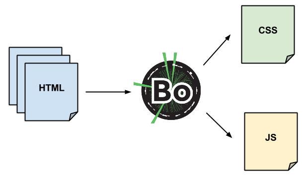
Bosonic
Transformation de code
Bosonic
Aujourd'hui
<element name="b-hello-world">
    <style>
        :host {
            color: red;
        }
    </style>
    <template>
        <p>Hello world!</p>
    </template>
    <script>
        ({
            readyCallback: function() {
                var root = this.createShadowRoot();
                root.appendChild(this.template.content.cloneNode(true));
            }
        });
    </script>
</element>
Bosonic
Dans quelques jours
<element name="b-hello-world">
    <template>
        <style>
            :host {
                color: red;
            }
        </style>
        <p>Hello world!</p>
    </template>
    <script>
        Bosonic.register({
            readyCallback: function() {

            }
        });
    </script>
</element>
Bosonic
- Syntaxe inspirée de la spec
- Plate-forme légère
- JS ou HTML en sortie
Bonnes pratiques
- Philosophie UNIX
- Privilégier la composition
- Penser DOM
- Penser mobile
- Accessibilité
- Fallback
Bonnes pratiques
Accessibilité

Bonnes pratiques
Fallback
<bar-chart>
    <table>
        <tr>
            <td>23</td><td>42</td><td>31</td>
        </tr>
        <tr>
            <td>68</td><td>82</td><td>91</td>
        </tr>
        <tr>
            <td>65</td><td>81</td><td>11</td>
        </tr>
    </table>
</bar-chart>
Questions / réponses
Production-ready ?
Questions / réponses
<my-app> ?
Questions / réponses
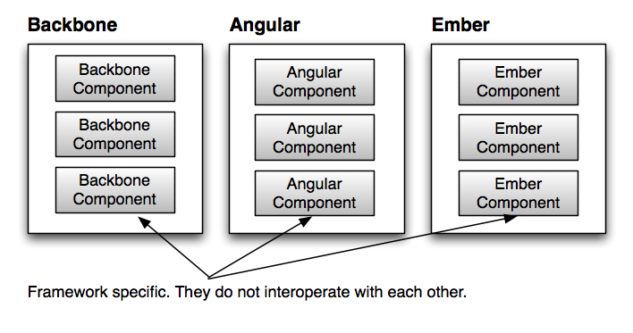
Quid d'Angular/Ember/React... ?
Merci de votre attention !
D'autres questions ?
@goldoraf